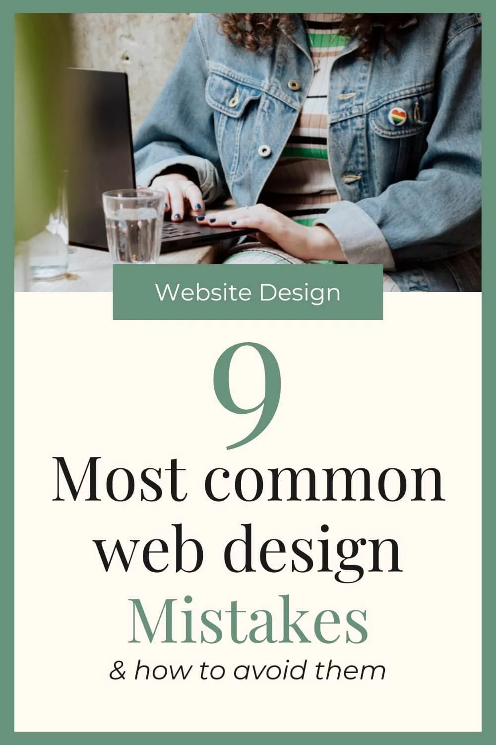
9 Common Web Design Mistakes & How To Avoid Them
When you’re designing your own website, its hard to know what to do and what not to do. You’re often so focused on design and getting everything on the page, that the little details tend to be forgotten. That’s exactly why I wanted to share some of the most common website mistakes I see people making when DIYing their websites.
These are mistakes I have seen first hand from members inside my membership, the DIY website club, where I support business owners who are building their own websites, as well as the 50+ business owners I have supported through my 5 years of web design.
They may seem a bit random I admit, but that’s why they’re so easy to forget!
Mistake #1 | Using images with text on them to create the look you want
When using website builders and grid layouts, it can be a little hard to get a design EXACTLY how you want it, so I understand the temptation to create a particular design on Canva or similar. However, crafting your website layout on a tool like this is good for getting things to sit perfectly, they are TERRIBLE for user experience and SEO.
These types of designs don’t look good on every device, so when you look at your site on mobile vs dekstop vs atablet, the design just doesn’t look right. You need a website that is responsive to the device size that someone is using.
They’re also terrible for SEO purposes too because text in images is not easily readable by search engines / AI tools and therefore it can negatively effect your chances of showing up in Google/Chat GPT/etc.…
Mistake #2 | Too cramped or too spacious
This is a classic mistake if you don’t have a “designers eye” because how much space is enough space? I wish I could answer it simply, but the trick here is to find a balance between having enough breathing room, but not too much empty space either.
I’ve included a screenshot example below to illustrate what I mean. One has slightly not enough breathing room so it feels subtly cramped. The other has slightly more breathing room around each of the elements and isn’t stretched across the whole size of the page, so it looks a lot easier on the eye.
Example 1: Too Cramped
Example 2: More Breathing Room
Mistake #3 | Avoid center aligning everything
This is something we have all been tempted to do at some point - center aligning all the text on our website. It saves having to worry about being left aligned on desktop but looking weird on mobile, etc…
But avoid the temptation - text shouldn’t be centre aligned unless necessary, I’d almost always recommend going for left aligned text.
Our eyes (in English speaking countries) read naturally from left to right and that is how we scan the page too. This is especially the case for paragraphs of text and blog posts. In these instances, centre aligned text starts to look messy and harder to read.
Mistake #4 | Not having enough buttons/CTAs
Having enough calls to actions and buttons on your website is a hill I will die on. You need to have buttons scattered throughout your website to encourage users to keep clicking through your website. By having repetitive CTAs, we can funnel people through our website and help them move closer towards our end goal e.g. purchasing or getting in touch via our contact page.
Similarly, you should absolutely always end on a CTA so you don’t leave someone hanging when they scroll to the bottom of the page. If they’ve scrolled to the bottom of the page, its a good sign that they’re interested in you/your services, so give them one final nudge to keep exploring/ get in touch.
Want to learn how to look after your website once it’s live? Download your FREE website care guide:

Mistake #5 | There should only be ONE H1 per page
When selecting the heading font for your titles, H1 is usually the biggest size wise, however you only want one H1 heading per page. Lots of people don’t realise that “heading 1/2/3/etx” is not just for aesthetic purposes, although the sizes often vary, it serves another purpose.
These different heading sizes help to create a hierarchy in the page which makes it clear, what the title of the page is, what is a subtitle etc… Therefore, there should only be ONE h1 per page, and the rest should be H2, H3 etc...
Mistake #6 | No privacy policy or T&Cs
This is probably the most serious on this list if you get it wrong, and that is not including a privacy policy on your website. A privacy policy is legally required for every website to let users know how you’re using their data. A terms and conditions is not legally required but still highly recommended to protect you and your readers. I have a whole blog post that goes in depth on why you need a privacy policy, but please make sure you don’t make this mistakes because it could result in legal issues.
Mistake #7 | Not having enough text on services pages (or too generic)
Different people buy in different ways which means that the amount of text you need on your website can vary. Some people are impulse buyers and some people want ALLLLL the deets before even getting in touch. For that reason, I usually recommend that services/sales pages have plenty of text on them to suit those more cautious buyer types. To better help the impulse buyers, you can break up this text with clear subheadings, bullet points and sections so its easy to skim read and people can easily find the information they need.
Similarly, you want to avoid falling into the super generic trap where you use chat gpt to write all your sales page copy. Consider your ideal customers, what types of buyers are they, what goals/struggles do they have, and write copy that they can relate to.
Mistake #8 | Having walls of too much text
I mentioned this in the previous point, but its really important that your text is written for skim-readers. It should have short paragraphs, bullet points, headings/subheadings, etc... to break up the text and make it easier to read. A good gauge of this is to look at your website on a mobile phone and see how big are the paragraphs, is it easy to read without having to scroll too much.
Mistake #9 | Forgetting the mobile design
The final mistake is one of the most important and that is making sure your website looks good on mobile and on desktop. You should be prioritisng your mobile version of your site, over your desktop version as that is where the majority of your readers will be looking at your website. Similarly, Google has switched to a mobile-first index which means that your site needs to look good and read well on mobile if you want it to show up in search results.
Wrapping Up
If you’re DIYing your website then hopefully learning these 9 mistakes will help you to create a website that looks professional. Of course, if you wanted further support and feedback on your website, you should check out The DIY Website Club which is a membership for business owners like you who are building their own websites but want that extra helping hand. I’d love to support you inside the membership!