8 Squarespace Design Hacks for Easier Website Design
Squarespace is known for being one of the easiest website building platforms available but that doesn’t mean there isn’t design hacks that will make your life even simpler. With 5+ years experience as a Squarespace web designer, I’ve learnt a a lot of tips that will save you time, prevent headaches and just make things go a lot smoother.
In this blog post, I’m sharing my best time-saving hacks that I’ve learnt over the years to make designing in Squarespace a whole lot faster and easier.
A LITTLE SECRET: This blog post is taken from one of my modules inside my paid membership, The DIY Website Club. I share all of my knowledge from 5 years of designing websites, in one affordable monthly membership. It has over 40 video modules and regular coworking calls for accountability. So if you’re currently building your own website, you should definitely check it out.
You can watch the video below, taken straight from the membership but I’m giving to you totally free:
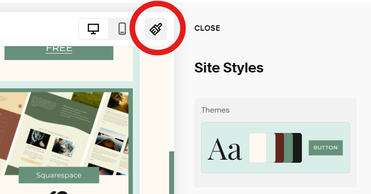
Set your site styles before you start building
This is one of the biggest time-savers when designing in Squarespace. Before you dive into building pages, take a few minutes to set your site styles. This includes things like your fonts, colours, button shapes, and heading sizes which you’ll want to set at a site-wide level.
It might not feel like a big deal, but this will save you from having to manually change everything later on (which can be a real headache when you realise your “perfect” heading size looks way too big on other pages).
Getting your site styles sorted at the start means you’ll have a consistent, cohesive design across your whole site, without needing to think about it every time you add something new.
Name image files so you can search for them
When you’re uploading lots of images, it’s so easy to end up with a folder full of files called “IMG_9372.jpg” and “Screenshot 2023-09-21.png.”
Instead, name your image files based on what they actually are: for example:
“squaresapce-web-design-homepage-hero.jpg”
“freya-padmore-about-page-portrait.jpg”
“testimonial-client-name.jpg”
That way, when you’re adding images to your website, you can just type in “hero” or “about” in Squarespace’s search bar and instantly find what you need.
It sounds small, but it makes the whole design process way more streamlined (and your future self will thank you).
It’s also a good idea for SEO purposes, as it helps search engines like Google know what the image is about, and is an opportunity for you to include more keywords on your website. Check out this blog post if you want to know more about optimising your site for SEO purposes.
Write your text BEFORE designing
This one might surprise you, but writing your copy before you start designing will make everything SO much easier.
Your writing brain and your design brain are totally different. Trying to write catchy copy while you’re also arranging blocks and tweaking layouts will slow you down and make everything harder. You’re basically asking your brain to switch between different modes constantly.
That’s why I highly recommend you write all of your website text (aka. your copy) in a Google Doc first. Once you’re happy with the words, then move on to designing.
The other added benefit is that you can then build your design around the content, not the other way around. That way, you won’t have to keep redoing layouts to make your text fit later on!
That’s EXACTLY why I ask my paying web design clients to share their copy before I ever start designing. (And I’m strict on it too!)
Duplicate pages or sections, don’t start from scratch
Spent a while creating a layout you now love? Duplicate it! Use it OVER and OVER again across your website.
Squarespace makes it super easy to duplicate sections or whole pages. This is especially handy when you want your pages to have a consistent layout, like your Services or Portfolio pages.
Instead of rebuilding everything from scratch, just duplicate a section and swap out the text and images. It’s one of those simple tricks that cuts your design time in half.
But its benefits goes beyond time saving - having a consistent/familiar structure and layouts creates consistency across your pages, which subtly makes your website looks much more put together.
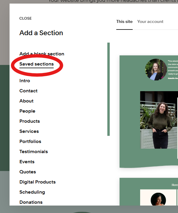
Squarespace’s best feature: Saved Sections
This is hands-down one of Squarespace’s most underrated features.
If you’ve created a section you love, maybe your testimonials, newsletter signup, or call-to-action, you can save it as a Saved Section.
That means you can quickly reuse it anywhere else on your site with just a few clicks. Similar to the point before, it will make your site more cohesive and save a ton of time.
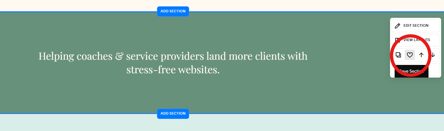
You can do this by hovering over a section until the blue lines appear, then clicking on the heart icon in the top right corner. (See screenshots above)
To insert these saved sections, when you go to add a new section to the page, click on “Saved Sections” on the left hand side and you’ll see a collection of all your saved sections. (See screenshots above)
Use the templates available in your website platform
If you’re not a confident designer, then I highly recommend you make the most of the templates available to you. Squarespace will encourage you to start off your website with a whole template, but you can also add in templated sections too.
Squarespace offers so many beautiful templates and pre-designed sections, you just need to customise them to fit your brand. BUT using them as a starting point will save you loads of time and make your life a whole lot easier.
They’re especially useful for creating pages like your blog or contact page, pages that don’t need tons of custom design work but still need to look polished and on-brand.
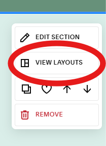
Squarespace’s AI Design Assist
Squarespace recently introduced an AI Design Assist feature, and honestly, it’s surprisingly good!
To use it, first create a new section and add all of the elements you need to the section. Then, when you hover over the section, you will see the “view layouts” option in the right hand options menu (see screenshot). You can then select from a range of AI designed sections to create a cleaner layout.
It’s not perfect, but it’s an amazing starting point if you’re feeling stuck or want a quick base design to tweak and make your own.
Final Thoughts
Squarespace has a tonne of amazing features that makes designing your website a lot easier. Luckily for us, that means designing your Squarespace website doesn’t have to take forever.
By setting up your styles early, writing your copy first, and using features like Saved Sections and templates, you can create a beautiful, cohesive website so much faster and actually enjoy the process!
If you’re someone who need a bit of accountability to get things done and wants to learn how to build a website that actually converts - I’d love to invite you inside The DIY Website Club. It’s an affordable monthly membership including lessons like this one, along with weekly 10-minute tasks and coworking calls. I know you’ll love it, and I’d love to see you inside.